Getting the colours right
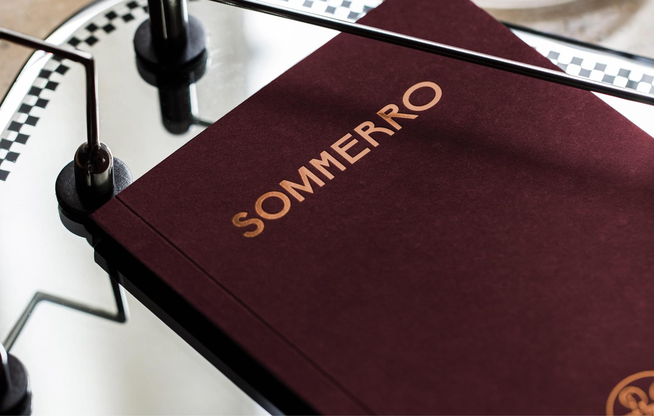
The Sommerro profile is built around a dark red hue with shiny copper details. In order to replicate the red, we recommend using Colorplan Claret coloured paper. This ensures the correct saturation of what is an integral part of the Sommerro identity.
If you are unable to acquire coloured paper, print in CMYK. Be aware of the importance of the dark red being dark enough. Go darker rather than lighter, adjusting the colour towards brown rather than purple. If printing large sections of dark red on white paper, bear in mind that the paper might absorb the ink unevenly.
For light backgrounds, Scandia 200 Ivory uncoated yellow-toned paper complements the saturated reds and golden tones with its warm and natural aesthetic.
The golden touch
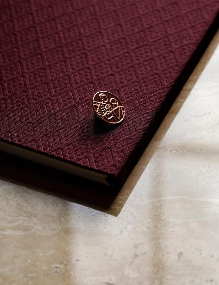
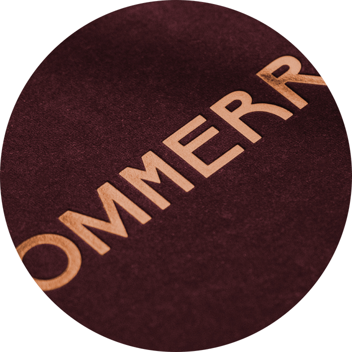
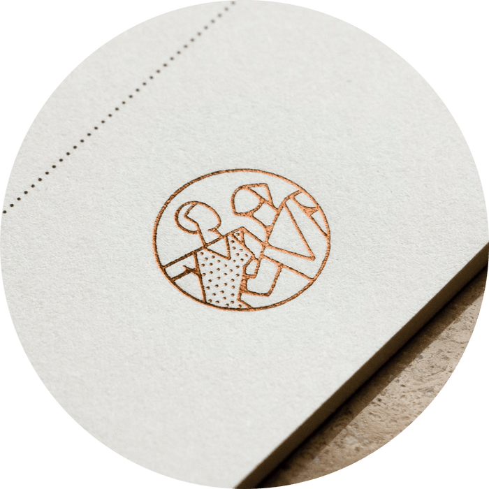
Titles, symbols and signatures are printed on coloured paper using Kurz Luxor 396 hot foil, adding a touch of elegance to the end result. The copper foil pops nicely on lighter surfaces too, making it a versatile and playful part of the profile.
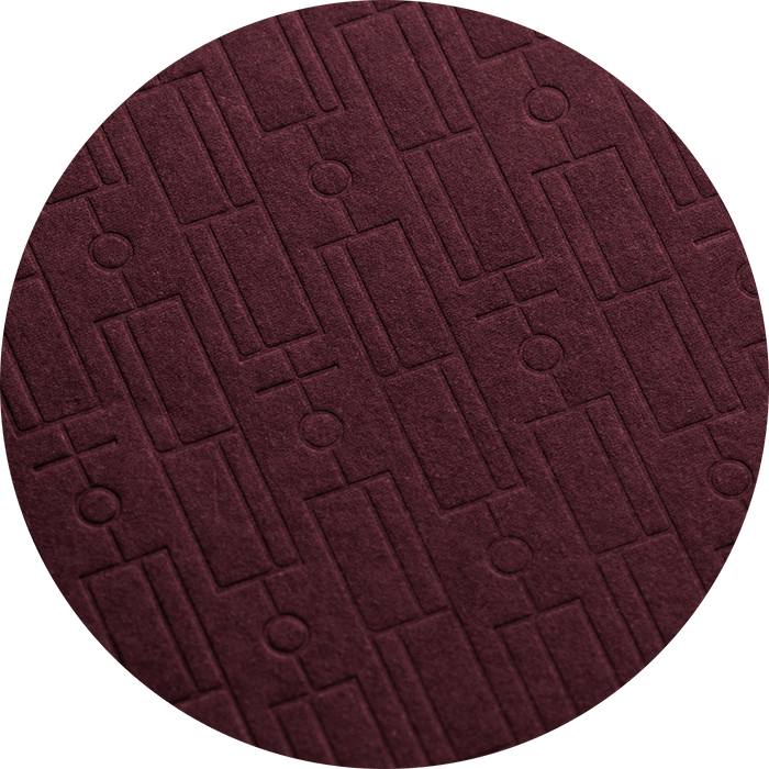
Blind embossed patterns spruce up larger surfaces, ensuring a subtle visual effect and a delicate tactility.
