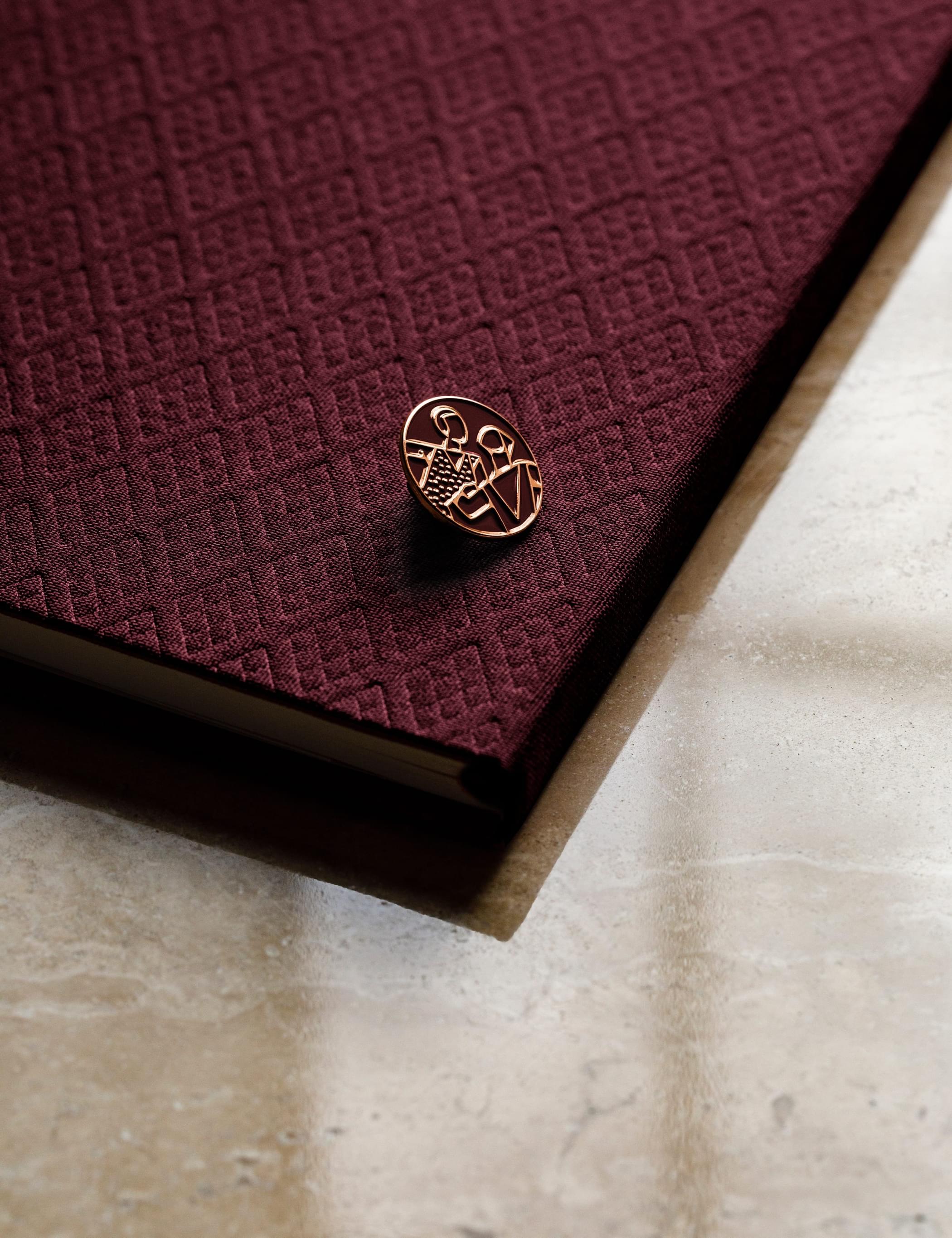
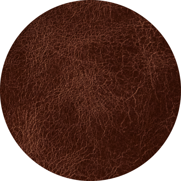
Dark red
The Sommerro brand is built around a dark red hue with elements of ochre and beige. The red is inspired by the hotel’s red brick façade and should be predominant in communication outside Sommerro – on the website, in social media, on business cards and so on. Once inside the building, the red should be toned down, replaced by neutral nuances that blend naturally with the art deco interior – beige and shades of dark brown.
The various subsections of Sommerro are identified by their own hues. Vestkantbadet wellness facility, Lysverker scene and restaurants Ekspedisjonshallen and To Søstre have their own, specific palettes, matching the overall Sommerro brand.
