Scandia Ivory paper
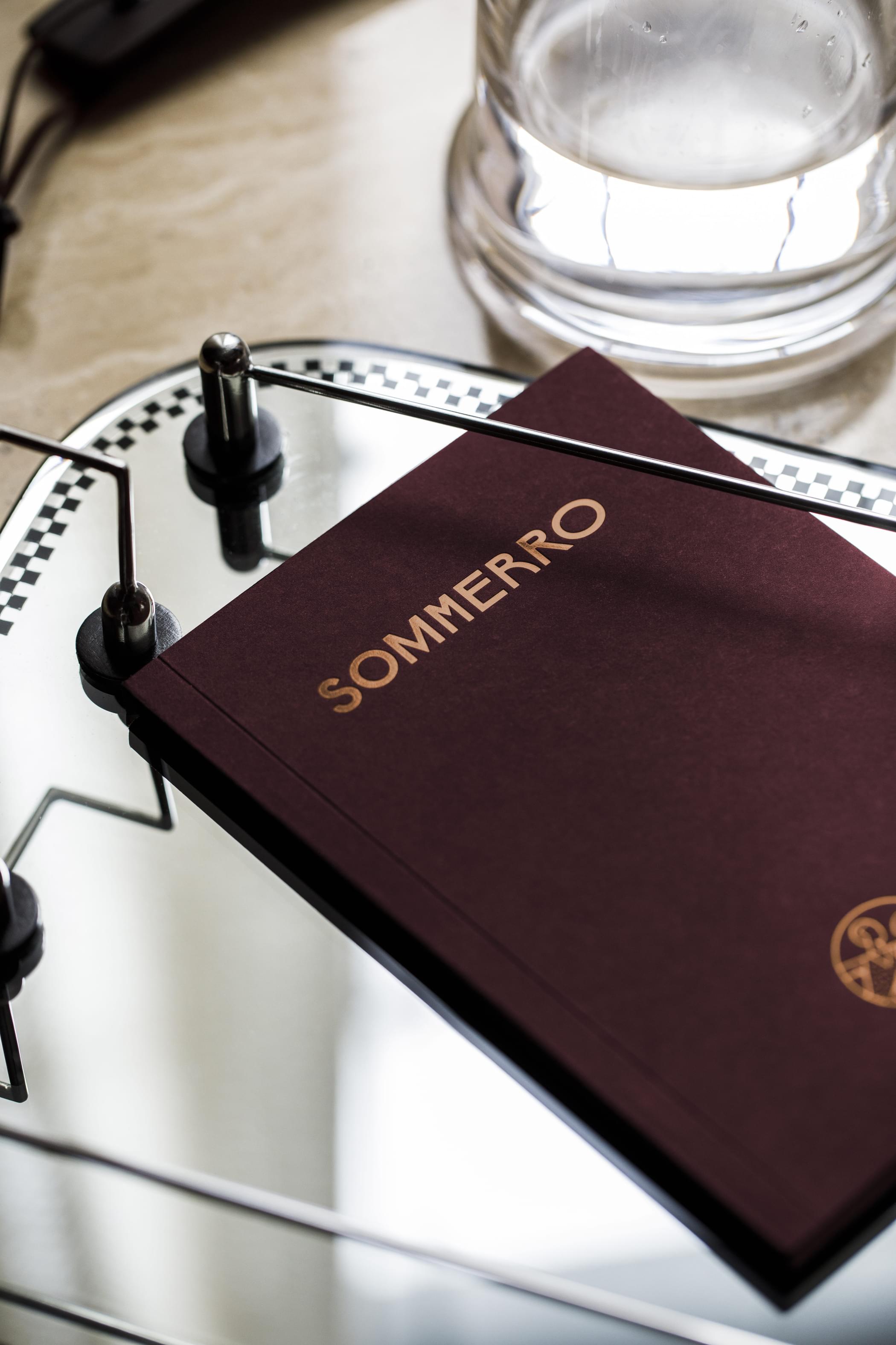
Wordmark
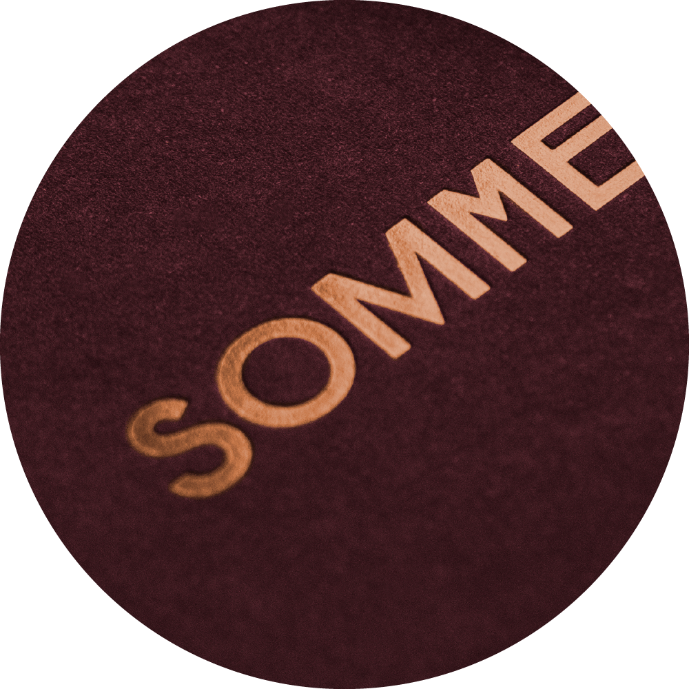
The wordmark is set in Sommerro Sans, with varying widths and active use of the alternates. The wordmark could also be animated.

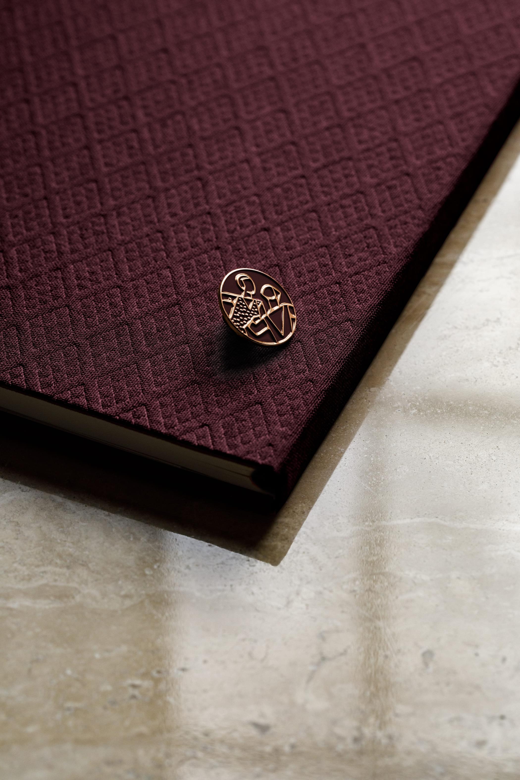
Symbol
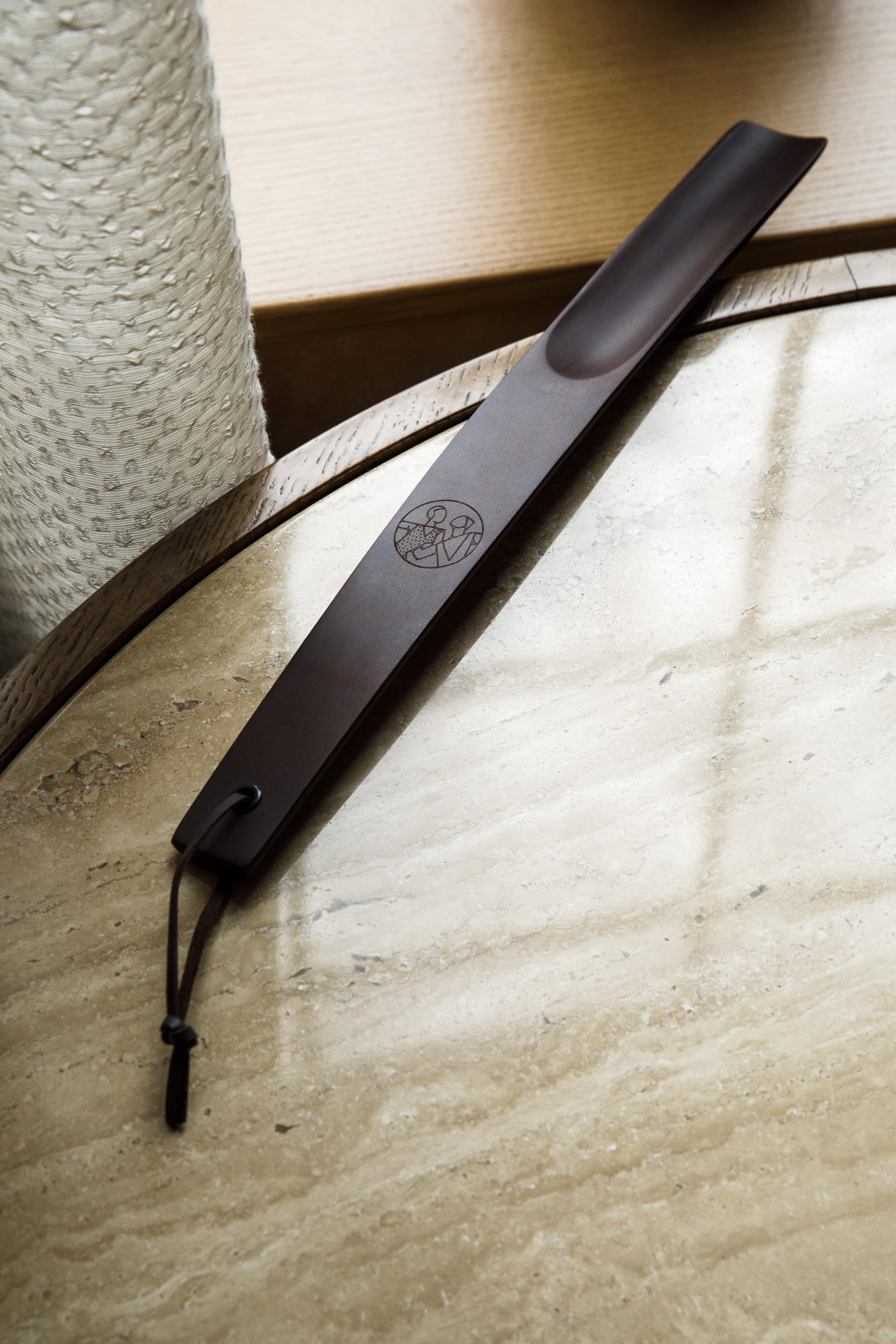
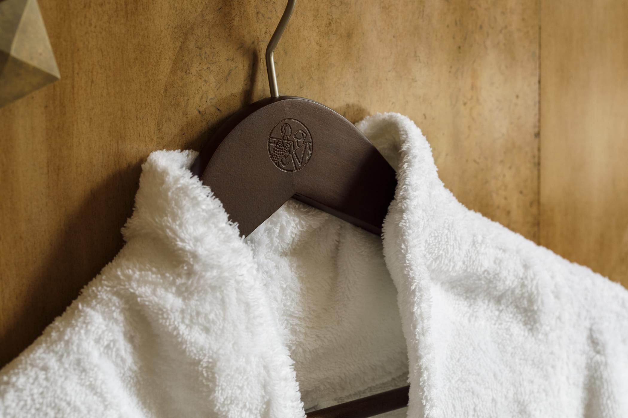
Our symbol can be used in a variety of settings, allowing us to communicate the brand without necessarily saying our name.
The symbol draws inspiration from several aspects of the Oslo Lysverker's history and permanent artworks. "To søstre" (The Two Sisters) was the name of the architectural concept, and Per Krohg's mosaic titled "Svømmende Kvinner og Seler" (Swimming Women and Seals) was unveiled in the basement bath Vestkantbadet in 1932. The style of the illustration is inspired by Gustav Vigeland's Iron Gates in Vigelandsparken in Oslo, from the same neighborhood and era. With the symbol, we put people at the core of the Sommerro identity.
Typography
The brand typography is mainly based on the two custom typefaces — Sommerro Sans and Serif. Each typeface contains a large set of alternates, ligatures and widths. Georgia and Helvetica works as a standard option for Microsoft Word etc.
Colours
Our core colour palette is based on the buildings brick facade and the electric energy of Oslo Lysverker. In addition, there’s separate secondary palettes for specific areas and restaurants like Vestkantbadet and Ekspedisjonshallen.
- Hex
- #351313
- RGB
- 53 • 19 • 19
- CMYK
- 50 95 75 80
- PMS
- 504 C
- Paper:
- Colorplan Claret
- Fabric:
- Cialux 1521
- Hex
- #e58848
- RGB
- 229 • 72 • 136
- CMYK
- 0 45 70 0
- PMS
- 157 C / 7411 U
- Hex
- #fbf0ea
- RGB
- 251 • 234 • 240
- CMYK
- 0 6 10 0
- Hex
- #fff9f5
- RGB
- 255 • 245 • 249
- Paper:
- Scandia Ivory
Icons
Our icons feature architecture and interior from different sections within Sommerro. There’s two icon sets, the main one showcasing the service offerings and ameneties at the house, and one simplified set for wayfinding. The main icons also has an additional version for bigger sizes with a shadow effect.


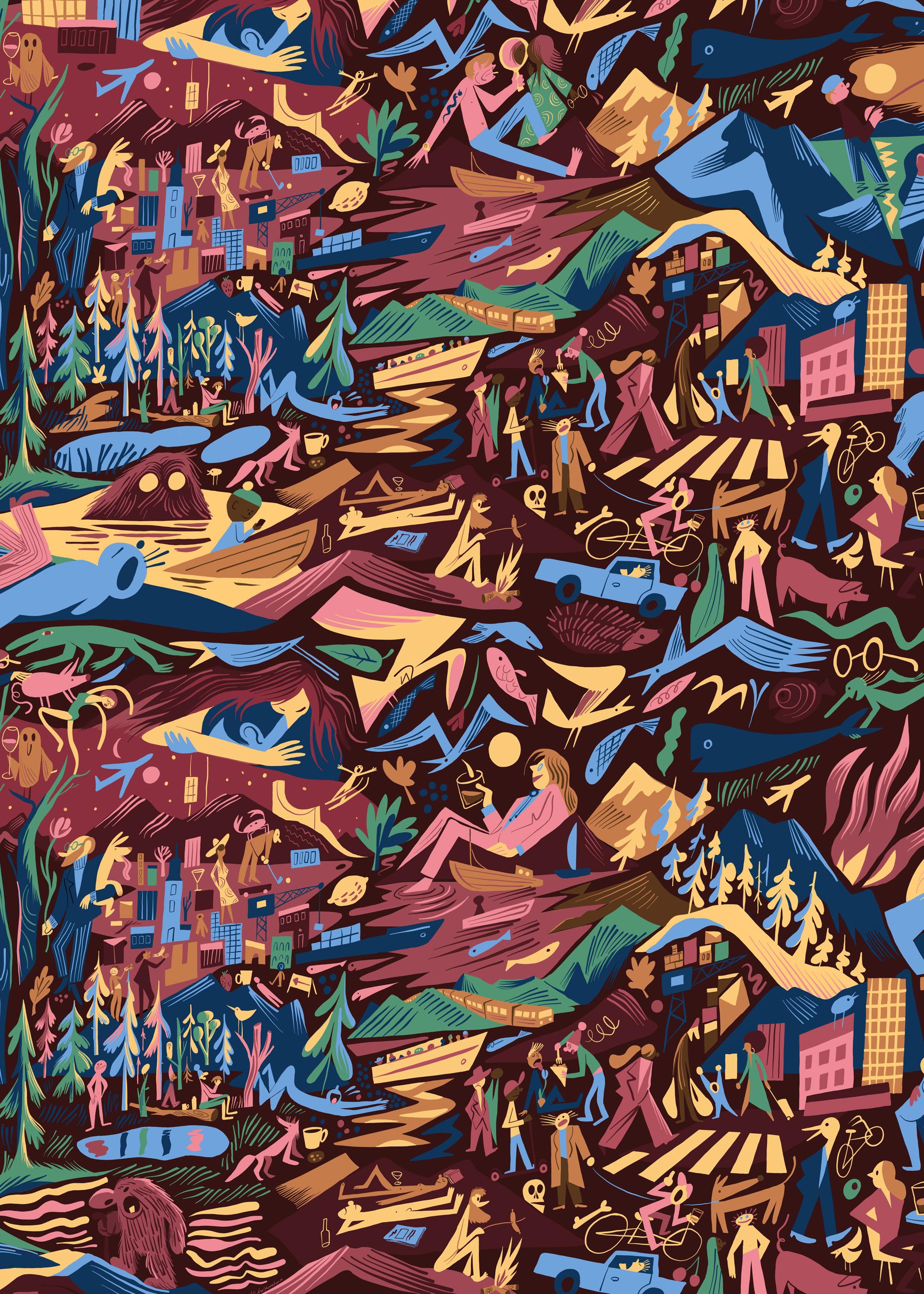
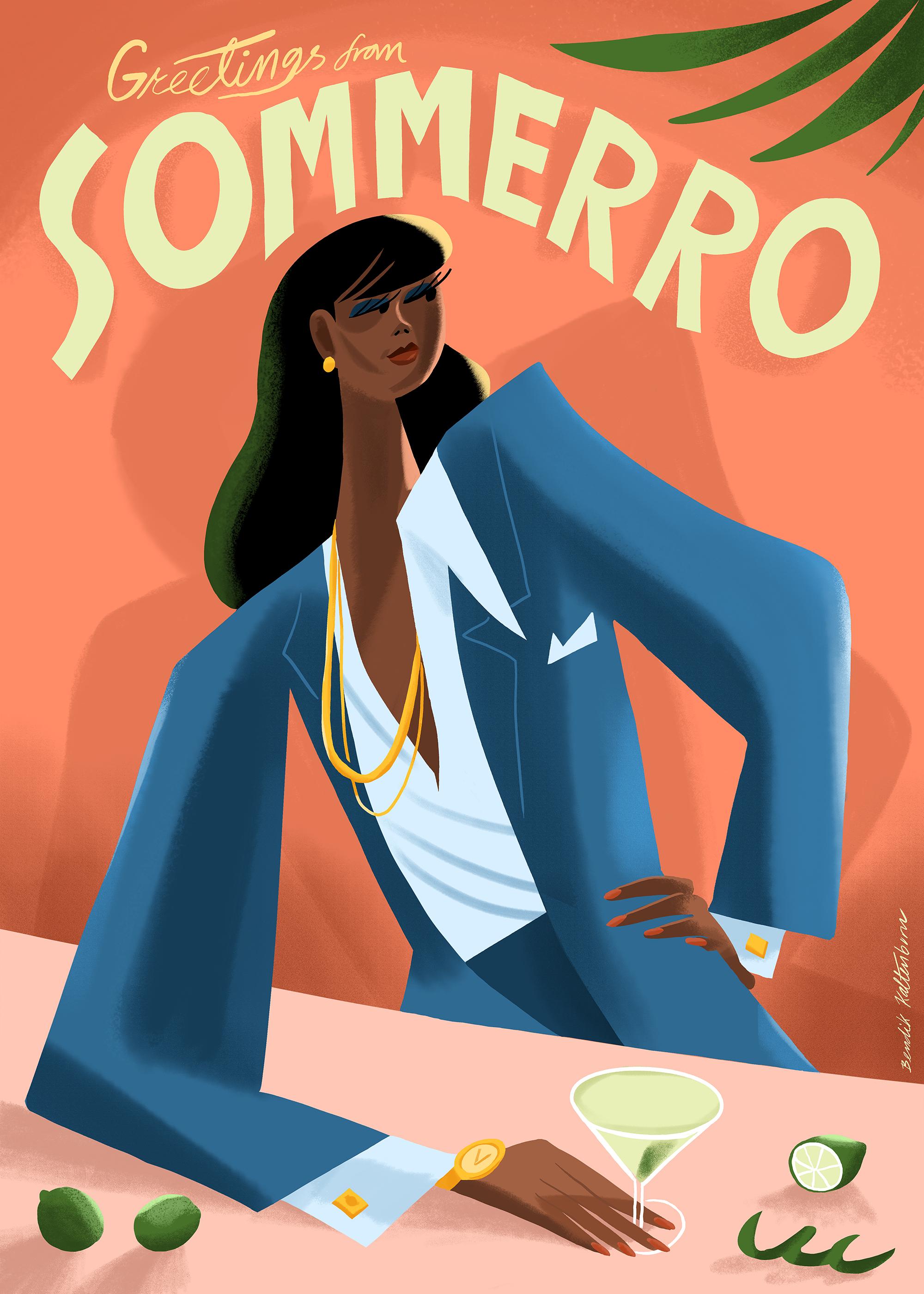
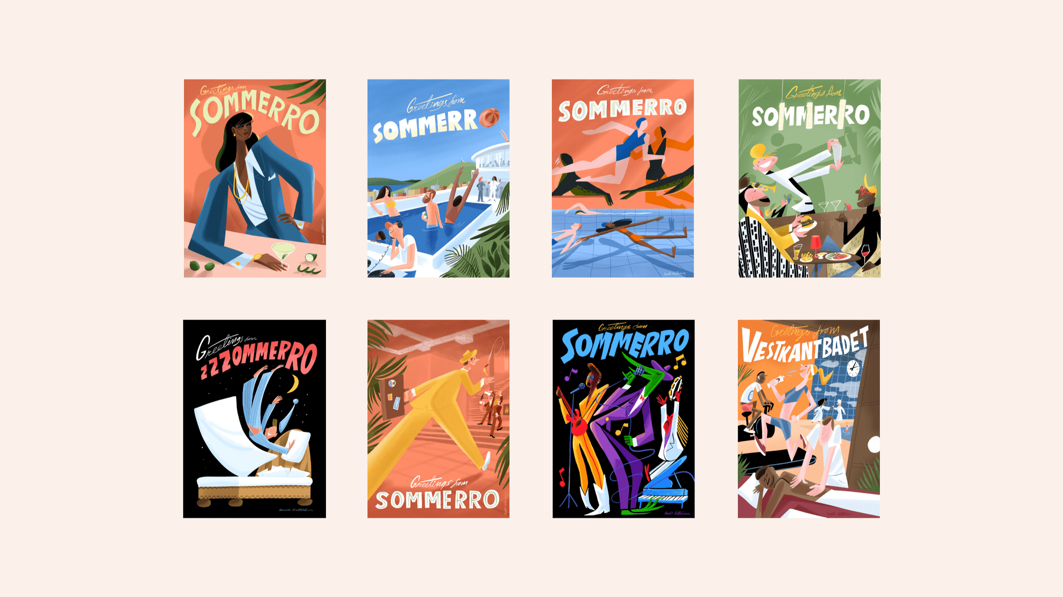
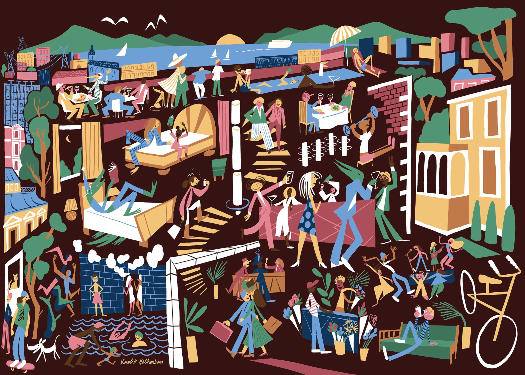
Illustrations
Bendik Kaltenborn is the illustrator behind all of Sommerro’s illustrations. His unique style and characters adds as a playfull element to the identity, and showcases the vibrant atmosphere across all of the Sommerro house areas and service offerings.
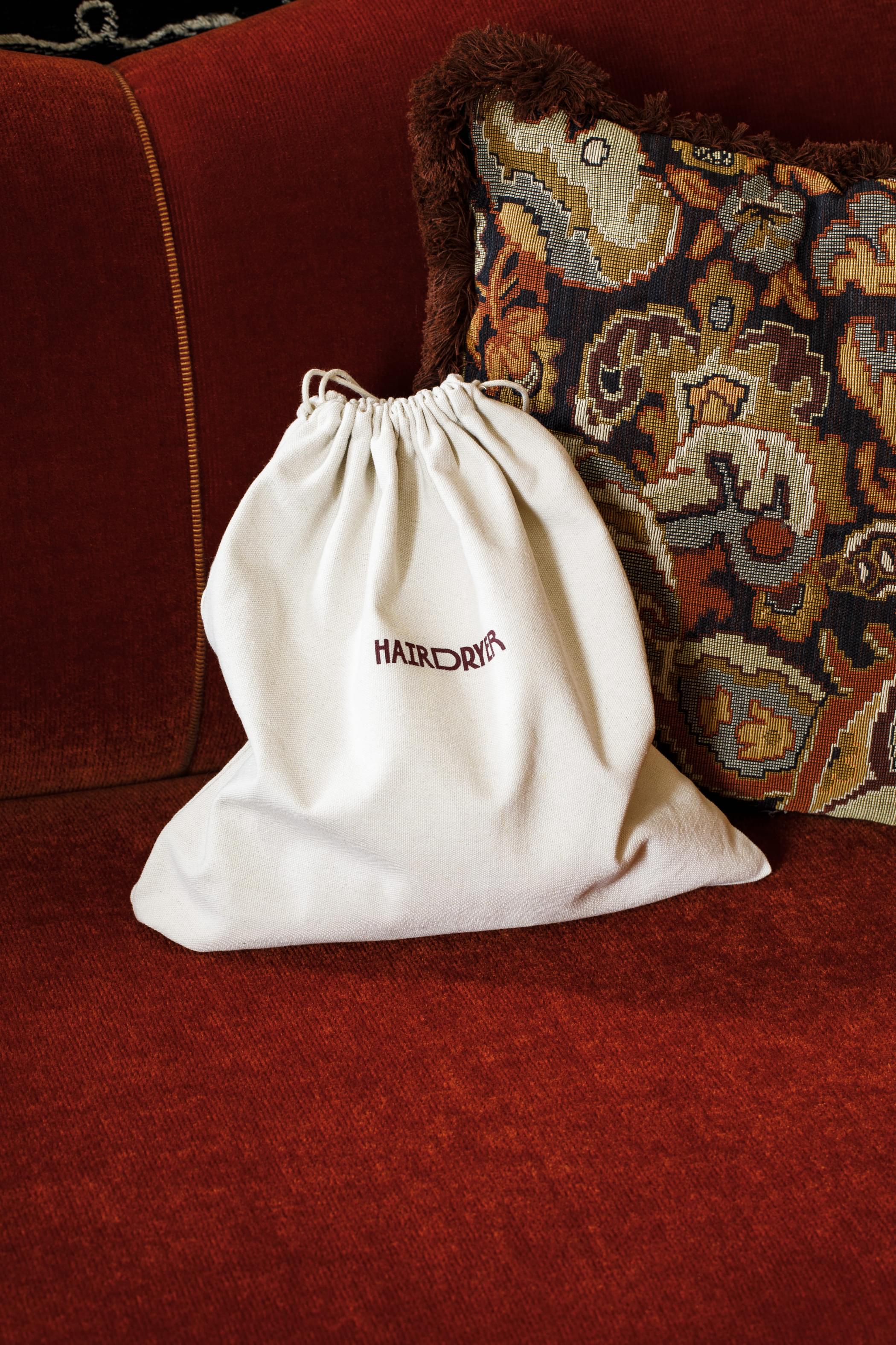
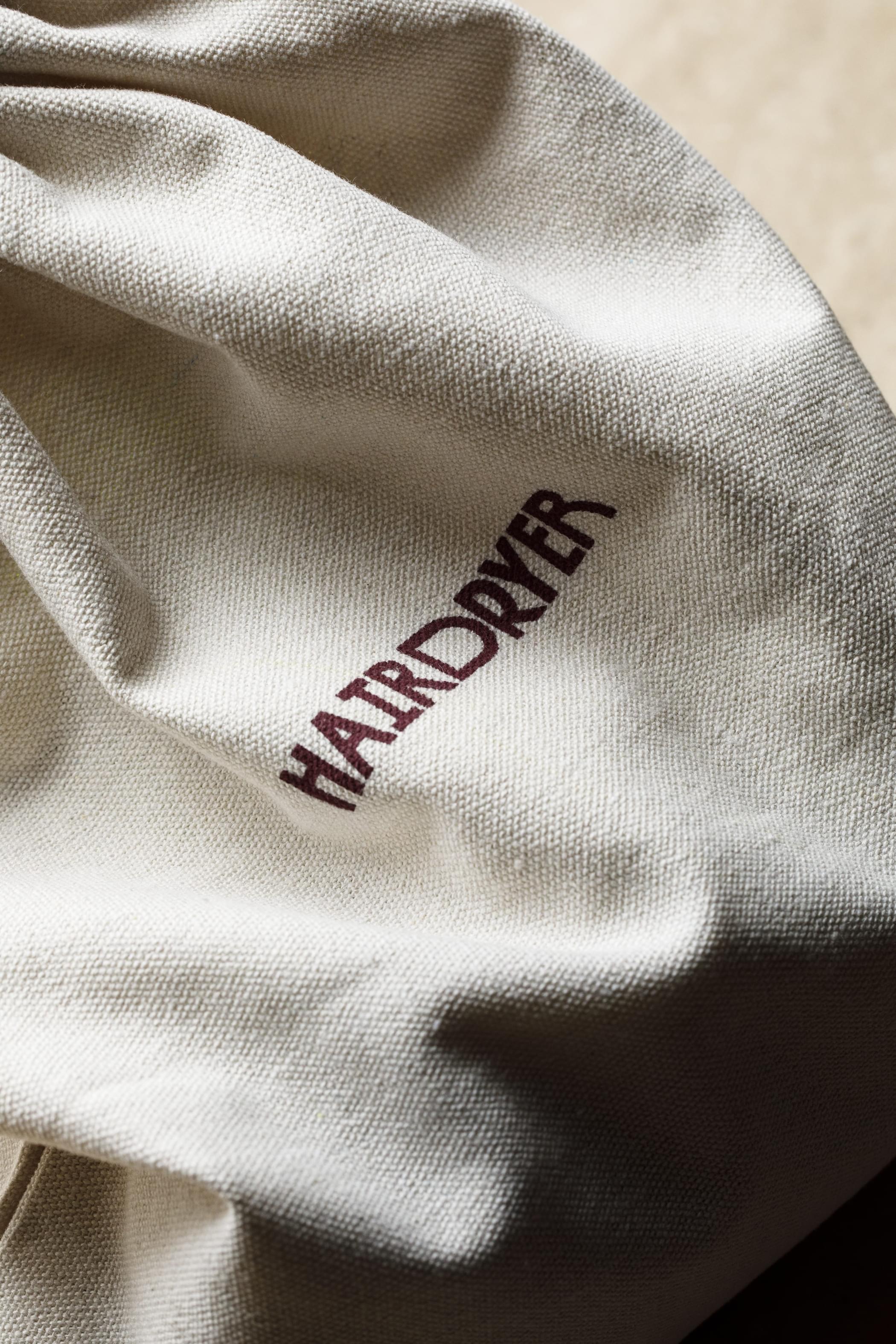
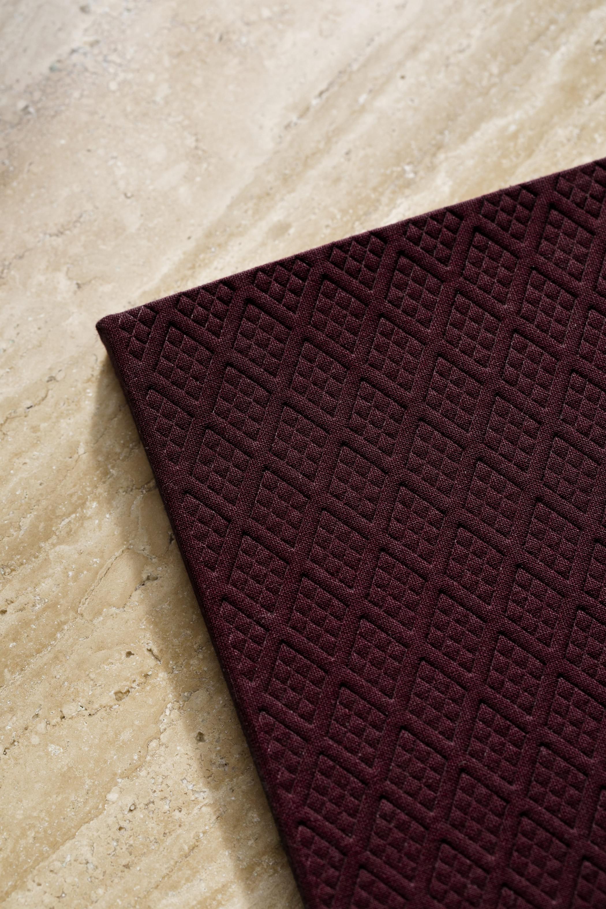
Materials
Whenever possible, we recommend using coloured paper or textile, rather than printing the red colour with ink. Copperfoil is also a good alternative to printing the yellow colour, and natural yellow-toned paper works well for the beige colour.
Our recommended materials:
Colorplan Claret • Cialux 1521 • Kurz Luxor 396 • Scandia Ivory

Natural cotton

Marble

Aged brass
Kurz Luxor 396 hot foil

Colorplan Claret paper

Cialux 1521 fabric

Leather
Implementation
Some examples of the identity in use.